Sometimes, improving application CSS can be as simple as a one-line upgrade or enhancement! Learn about 12 properties, start incorporating them into your projects, and enjoy the fun of reducing technical debt, eliminating JavaScript, and easily winning user experience.
Explore properties in the following categories:
- Stable Upgrades: Fix hacks or issues by replacing old techniques
- Stable Enhancements: Provide a better experience with well-supported modern properties
- Progressive Enhancements: Offer an upgraded experience when these properties are supported, without harming unsupported browsers
Stable Upgrades#
The following well-supported properties can help fix hacks or long-standing issues by replacing old techniques.
Aspect Ratio#
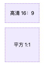
Have you ever used the “padding hack” to force a video embed to have a specific aspect ratio (like 16:9)? As of September 2021, the aspect-ratio property is stable across common browsers and is the only property needed to define an aspect ratio.
For HD video, simply use aspect-ratio: 16/9. For a perfect square, only aspect-ratio: 1 is needed, as the implied second value is also 1.
.aspect-ratio-hd {
  aspect-ratio: 16/9;
}
.aspect-ratio-square {
  aspect-ratio: 1;
}
HD 16:9, Square 1:1
Notably, the aspect-ratio property has a high tolerance for content, allowing content to take priority. This means that when content causes an element to exceed its ratio in at least one dimension, the element will still grow or change shape to accommodate the content. To prevent or control this behavior, you can add other sizing properties like max-width, which may be necessary to avoid exceeding a flex or grid container.
/* Applied to the flexbox children which have a size constraint from their parent */
.aspect-ratio-square {
  aspect-ratio: 1;
}
If you are not willing to completely replace the padding hack and still want to provide some sizing constraints, check out the Smol Aspect Ratio Gallery for a progressively enhanced solution using aspect-ratio.
Object Fit#
This is actually the oldest property on this list, but it addresses an important issue and absolutely fits the spirit of one-line upgrades.
Using object-fit allows an img or other replaced elements to act as a container for its content, making that content resize similarly to background-size.
While there are several values available for object-fit, here are the ones you are most likely to use:
coverresizes the image to cover the element while maintaining its aspect ratio, so the content does not get distortedscale-downresizes the image within the element (if necessary) so that it is fully visible without being clipped, maintaining its aspect ratio, which may result in extra space around the image (a "letterbox") if the element has a different rendered aspect ratio.
In either case, object-fit is a great property to pair with aspect-ratio to ensure that images do not get distorted when applying a custom aspect ratio.
.image {
  object-fit: cover;
  aspect-ratio: 1;
  /* Optional: constrain image size */
  max-block-size: 250px;
}

Margin Inline#
One of many logical properties, margin-inline is used to set the shorthand for inline (left and right in horizontal writing modes) margins.
The replacement here is simple:
/* Before */
margin-left: auto;
margin-right: auto;

/* After */
margin-inline: auto;
Logical properties have been around for a few years now and are supported at up to 98% (occasionally requiring prefixes). Check out Ahmad Shadeed's article for more information on using logical properties and their importance for websites with an international audience.
Stable Enhancements#
These well-supported modern CSS properties can provide a better experience and can even replace old methods or JavaScript-assisted solutions. Fallback solutions may not be necessary, but it depends on your specific application considerations, and testing is always encouraged.
Text Underline Offset#
Using text-underline-offset allows you to control the distance between the text baseline and the underline. This property has become part of my standard reset, applied as follows:
a:not([class]) {
  text-underline-offset: 0.25em;
}
You can use this offset to clear descenders and (subjectively) improve readability, especially when links are grouped closely together, such as in a bulleted list of links.
This upgrade may replace outdated tricks like borders, pseudo-elements, or even gradient backgrounds, especially when used with its friends:
- text-decoration-color to change the underline color
- text-decoration-thickness to change the thickness of the underline.
Outline Offset#
Have you ever used pseudo-elements to provide a custom outline when you want the distance between an element and its focus outline?
Good news! You may have missed the long-available outline-offset property (which has existed since 2006!), which can push the outline away from the element with a positive value or pull the outline in with a negative value.
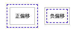
In the demonstration, the gray solid line is the element's border, and the blue dashed line is the outline positioned by outline-offset.
.outline-offset {
  outline: 2px dashed blue;
  outline-offset: var(--outline-offset, .5em);
}
Positive Offset Negative Offset
Note: The outline does not count as part of the element's box size, so increasing the distance does not increase the amount of space the element occupies. This is similar to how box-shadow is rendered and does not affect the size of the element.
Learn more about using outline offset as an accessibility improvement for focus visibility.
Scroll Margin Top/Bottom#
The scroll-margin property set (and corresponding scroll-padding) allows you to add offsets to elements in the context of scrolling positions. In other words, adding scroll-padding-top can increase the scroll offset above an element without affecting its layout position within the document.
Why is this useful? Because it can alleviate the issue of sticky navigation elements covering content when activating anchor links. Using scroll-margin-top can increase the space above an element when scrolling to it via navigation, compensating for the space taken up by the sticky navigation.
I like to include a universal starting rule for any element with an [id] attribute in my resets, as it has the potential to become an anchor link.
[id] {
  scroll-margin-top: 2rem;
}
The modern CSS article on component-based architecture explores an alternative selector that is also used on this site and can be tested using the links in the article directory sidebar.
For a more robust solution when considering overlaps with sticky, fixed, or absolutely positioned elements, you may need to use custom properties with fallback values. Then, with the help of JavaScript, measure the actual distance needed and update the custom property value.
[id] {
  /* Update --scroll-margin with JS if needed */
  scroll-margin-top: var(--scroll-margin, 2rem);
}
I encourage you to further enhance this solution and use logical property equivalents: scroll-padding-block-start and -block-end.
Color Scheme#
You may be familiar with the media query used for prefers-color-scheme to customize dark and light themes. The CSS property color-scheme is a way to adjust browser UI elements (including form controls, scrollbars, and CSS system colors). Adjusting this requests the browser to render these items using light or dark schemes, and this property allows you to define a preference order.
If you want to enable adaptation for the entire application, set the following on :root, choosing the preferred dark theme (or reverse the order to choose the preferred light theme).
:root {
  color-scheme: dark light;
}
You can also define color-scheme for individual elements, such as adjusting form controls within elements with dark backgrounds to improve contrast.
.dark-background {
  color-scheme: dark;
}
Learn how to easily implement dark mode using color scheme from Sara Joy's demonstration, along with more information on merging this feature.
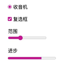
Accent Color#
If you've ever wanted to change the color of checkboxes or radio buttons, then you've been looking for accent-color. With this property, you can modify the appearance of :checked radio buttons and checkboxes, as well as the fill state of progress elements and range inputs. If you have no other overrides, the browser's default focus "halo" may also be adjusted.
:root {accent-color: mediumvioletred;}
Consider adding accent-color and color-scheme to your baseline application styles for quick custom theme management.
If you need more comprehensive custom styles for form controls, check out the modern CSS series starting with styled radio buttons.
Width: Fit Content#
One of my favorite hidden gems in CSS is using fit-content to "shrink-wrap" elements to contain their content.
While you might use inline display values (like) display: inline-block to shrink an element's width to its content size, upgrading to width: fit-content can achieve the same effect. The advantage of width: fit-content is that it retains the display value, so it won't change the element's position in the layout unless you also adjust that value. The computed box size will adjust to the size created by fit-content.
.fit-content {
  width: fit-content;
}
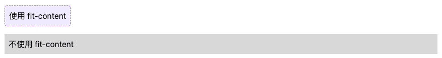
This value is one of several keywords that enable intrinsic sizing with fit-content.
Consider upgrading this technique to a version equivalent to logical properties: inline-size: fit-content.
Progressive Enhancements#
The last set of properties provides an upgraded experience when supported and can be used in unsupported browsers without worrying about causing harm. This means they do not require fallback methods, even though they are newer additions to modern CSS.
Scroll Behavior#
The default behavior of a scrollable area (a limited-size area that allows overflow scrolling) is that when scrolling exceeds the bounds of the element, the scroll interaction will pass to the background page. For your users, this can be unpleasant at best and frustrating at worst.
Using overscroll-behavior: contain isolates scrolling to the containing area, preventing further scrolling by moving the scroll to the parent page once the scroll boundary is reached. This is useful in cases like sidebar navigation links, which may have independent scrolling from the main content of the homepage (which could be a long article or document page).
.sidebar, .article {
  overscroll-behavior: contain;
}
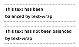
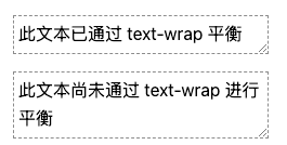
Text Wrap#
One of the newest properties (as of 2023) is text-wrap, which has two values that address uneven line typography issues. This includes preventing "orphans," which is when a single lonely word appears on the last line of text.
The first available value is balance, which aims to balance the number of characters per line of text.
Since wrapped text is limited to six lines, this technique is best used for headings or other shorter text paragraphs. The limited application also helps to limit the impact on page rendering speed.
:is(h1, h2, h3, h4, .text-balance) {
  text-wrap: balance;
  /* For demonstration */
  max-inline-size: 25ch;
}
The other value<font style="background-color:rgb(255,245,235);">pretty</font>is specifically designed to prevent orphans and can be applied more broadly. The algorithm behind<font style="background-color:rgb(255,245,235);">pretty</font>will evaluate the last four lines in a block of text to adjust as needed to ensure that the last line has two or more words.
p {
  text-wrap: pretty;
  /* For demonstration */
  max-inline-size: 35ch;
}
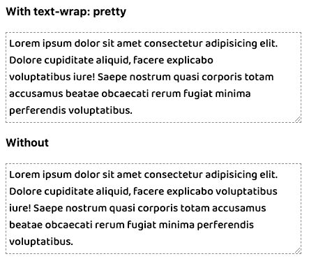
Using text-wrap is a great progressive enhancement. However, any adjustments will not change the computed width of the element, so in some layouts, the side effect may be an unnecessary increase in space next to the text.
Scrollbar Gutter#
In some cases, the appearance or disappearance of a scrollbar can cause unnecessary layout shifts. For example, when displaying a dialog overlay and adding overflow: hidden to the background page to prevent scrolling, removing the scrollbar that is no longer needed can cause layout shifts.
The modern CSS property scrollbar-gutter allows you to reserve space for the scrollbar in the layout, preventing such unnecessary shifts. When the scrollbar is not needed, the browser will still draw a gap as extra space beyond any padding on the scroll container.
Important Note: This property only works when the user's system setting is not "overlay" scrollbars, such as the default setting in Mac OS, where scrollbars only appear as overlays on scrolling content. Do not give up padding, scrollbar-gutter, because when using overlay scrollbars, you will lose all expected space.
Since this is visually noticeable extra space, you can choose to use two keywords to assign this property: . Using scrollbar-gutter: stable both-edges alone will only add a gap where the scrollbar would normally be, while adding the preference will also add space on the other side of the scroll container. This can ensure visual balance when the layout does not yet require the scrollbar to be visible. Check out Ahmad Shadeed's visual effects using scrollbar-gutter. stable both-edges
Original source:https://moderncss.dev/12-modern-css-one-line-upgrades/
Posted on: Jan 19, 2024 Written by Stephanie Eckles